One identity expressed across the website, outbound acquisition, and the paid reader product. This page shows the current system without turning email-specific choices into universal brand rules.
Current baselineREV 2 owns the core identityThe V5.6 email profile owns email-specific sizing, spacing, and supporting colors.
08 / The specimen sheet · identity as a family tree
One identity, deliberately different applications
The lockup and palette sit at the top of the sheet; rules descend to the applications. The email profile is drawn at its real type scale, the product email and landing page as their documented structures, cold outreach as plain text. Descendants inherit the family resemblance, not every email size or section.
Core identity
Applications · scope matters
Inheritance rule
Core identity · REV 2
Current working application
Reference · separate live implementation
Family resemblance from the core; scope from the application
Tourer Green carries the brand. Deep Blue is a restrained detail color. Lime Signal is an accent for pinlines, signal states, and small active moments—not a field color. Aptos, Segoe UI, Arial; never typewriter, monospace, terminal, or coding-interface typography.
Palette + mark + family
REV 2 core identity
Official mark (A / Blue Frame default; B / Lime Frame sparingly; white knockout on dark), core palette, general typography family, premium editorial character, reader promise, and disciplined lime usage. Changes here require an explicit brand decision.
Takes inNamed brand-kit baseline.
Hands onShared color, mark, and general identity.
CheckThis design revision preserves the original brand assets.
660px content width, the 42/30/21/18/15/11 email type scale, Signal Blue and Warm Separator, greeting, section rhythm and footer treatment. These choices govern the email application, not all branded output.
Takes inCore brand plus selected email learnings.
Hands onSix type levels, greeting, section rhythm and footer treatment.
CheckThese choices govern the email application, not all branded output.
Branded masthead, human greeting, story map, dominant lead image, lead analysis, weighted secondary reads, quick hits, forward watch, poll, and restrained footer. Received-form proof still determines whether the implementation works.
Takes inScoped email profile and issue content.
Hands onThe selected newsletter composition.
CheckReceived-form proof still determines whether the implementation works.
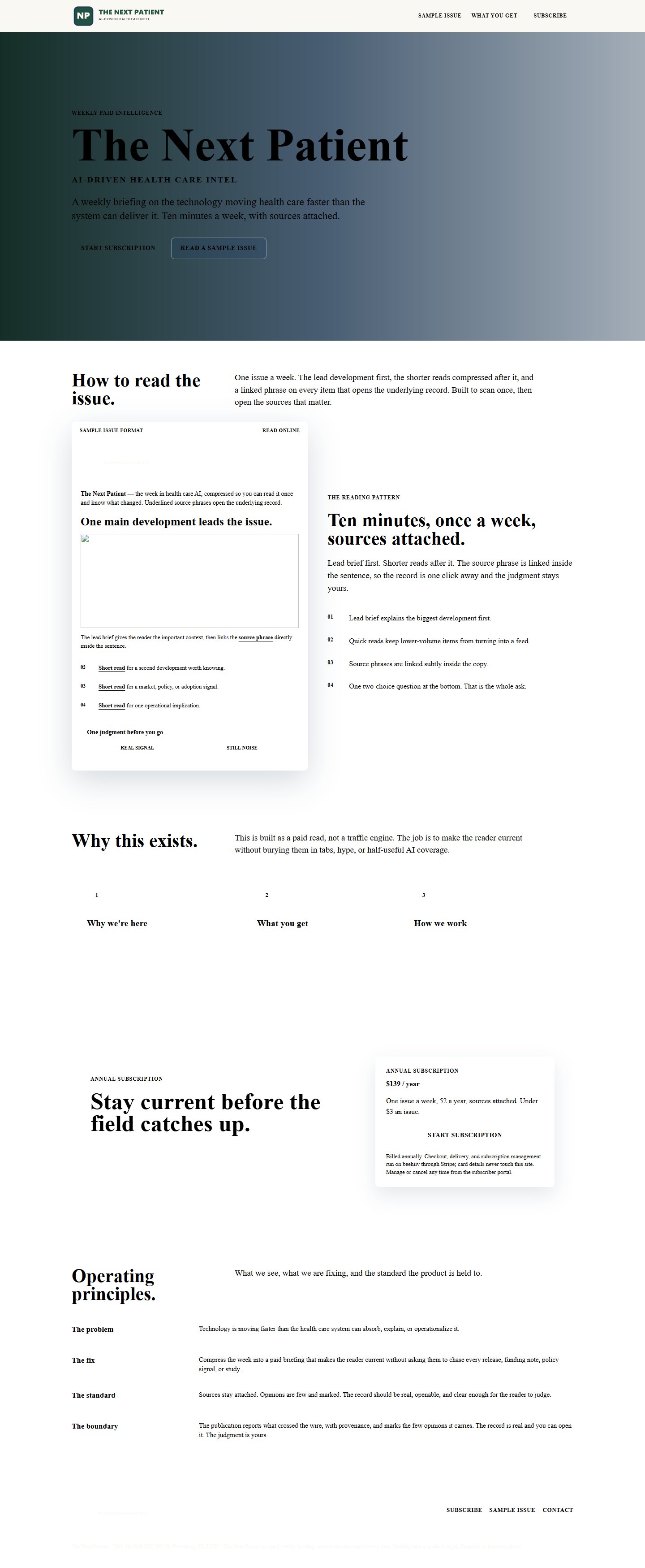
Explains the weekly product, reading pattern, offer, and operating principles. It remains visually behind V5.6. The live Beehiiv page and the independent product site at thenextpatient.com are separate implementations to align.
Takes inCore identity, positioning and conversion story.
Hands onAn example landing treatment.
CheckThe live Beehiiv page is a separate implementation to align.
Plain text is the intended treatment. No heavy masthead, stock imagery, or lime spectacle. The job is to earn a reply or a sample read while preserving the same promise and voice.
Takes inCore voice, audience and sample issue.
Hands onAn invitation to read a relevant example.
CheckDo not impersonate the paid newsletter in a prospecting message.
REV 2 + scoped email application + V5.6 are the recorded baselines. The live root product site and Beehiiv subscription surface are separate implementations.
What this page cannot do
Turn an email-specific choice into a universal brand rule, or approve a new surface.
THE NEXT PATIENT
AI-driven health care intel
Positioning spine · working, not doctrine
See what’s arriving before it arrives.
Weekly AI intel for people in health care: earlier signals, useful interpretation, evidence attached, and a reading experience designed to fit inside ten minutes.
CadenceOne weekly briefing
Reader jobKnow what is changing
Offer$139/year · annual only
Visual identity · locked core values
Palette
Tourer Green and Deep Blue carry authority. Lime is a signal, not a field color. Paper neutrals make the product feel editorial rather than clinical or software-generic.
Ink#111714
Tourer Green#24513F
Deep Green#173529
Deep Blue#163B63
Lime Signal#D9EA00
Editorial Paper#F7F4EA
Warm Linen#EFE9DD
Source Frost#EEF1F4
Email Signal Blue#8FD3E8
Email Separator#CFC8BA
Typography hierarchy
Readable first, distinctive through composition
Aptos is the preferred family, with Segoe UI and Arial as durable fallbacks. The distinction comes from scale, weight, pacing, and editorial layout—not a fragile webfont dependency.
The next patient · weekly intelligence
What’s arriving next?
The body is calm, generous, and built for sustained reading. The minimum core body size is 18px; labels are 12px uppercase sans, never decorative monospace.
Email application scale
Lead headline42 / 48
Section title30 / 36
Secondary21 / 27–28
Body18 / 25–29
Supporting15 / 20–24
Utility11 / 15–16
Current outputs · structure of the named files
What the product and landing page are built from
These schematics explain structure. The exact proof files are available immediately below them so the board can support a real approval decision.
Paid product emailSelected V5.6 working baseline · schematic
The selected product direction: branded masthead, human greeting, story map, dominant lead image, lead analysis, weighted secondary reads, quick hits, forward watch, poll, and restrained footer. Render proofs: R2 output/tnp/2026-09-02/codex/email-v5.6-working-base/ via MANIFEST.csv.
Website / landing pageRepository V3 · schematic
The current landing-page file: it explains the weekly product, reading pattern, offer, and operating principles. It remains visually behind V5.6. The live product site at thenextpatient.com (verified 6 Sep) is a separate implementation.
Exact proof access
Open what is actually being judged
Each item is version-labeled. The V3 landing image is historical; the live root site is the current web implementation.
The acquisition message should feel personal and earn a sample read; it should not masquerade as the paid editorial product.
THE NEXT PATIENT
Steve—
Health care is about to absorb another wave of AI products, policy changes, and new care models. The hard part is knowing which ones matter before they become obvious.
I publish one short, source-linked briefing each week for people close to that change.
Worth sending you a sample issue?
The Next Patient
V1 exists · platform open
Plain text is the intended treatment
No heavy masthead, stock imagery, or lime spectacle. The job is to earn a reply or a sample read while preserving the same promise and voice.
Reader logic
How the promise is delivered
The positioning only works if the full experience keeps answering the reader’s two questions: “Why should I care?” and “What should I carry forward?” The brand is the quality of this sequence—not merely the logo at the top.
No.
Moment
Reader job
What delivers it
01
Discover
See the signal
A change appears before consensus forms.
02
Verify
Follow the evidence
Sources make the selection inspectable.
03
Interpret
Understand the shift
The copy explains what changed and why.
04
Prioritize
Know what matters
Weight and hierarchy prevent overload.
05
Remember
Carry it forward
Voice, image, and pacing create recall.
06
Act
Watch the next proof
The close names what could change the read.
07
Return
Build the habit
Trust in selection earns the next open.
Application boundary
What can change—and what cannot drift
Core identity
Official mark, core palette, general typography family, premium editorial character, reader promise, and disciplined lime usage. Changes here require an explicit brand decision.
Boundary
Email application profile
660px content width, email type scale, signal blue, warm separator, and received-form spacing. These serve email constraints and do not automatically rewrite every other surface.